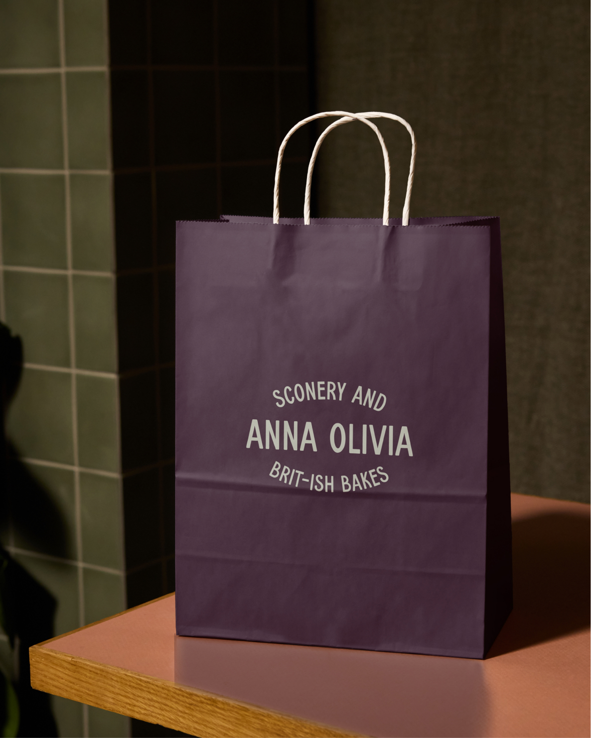
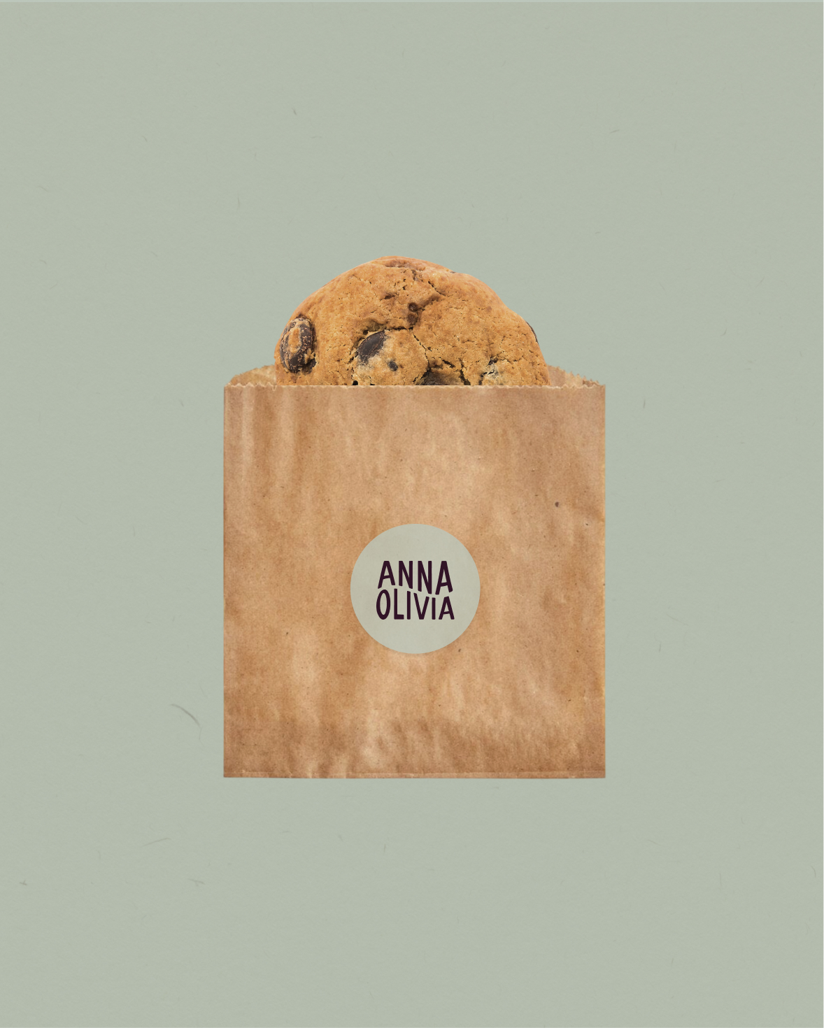
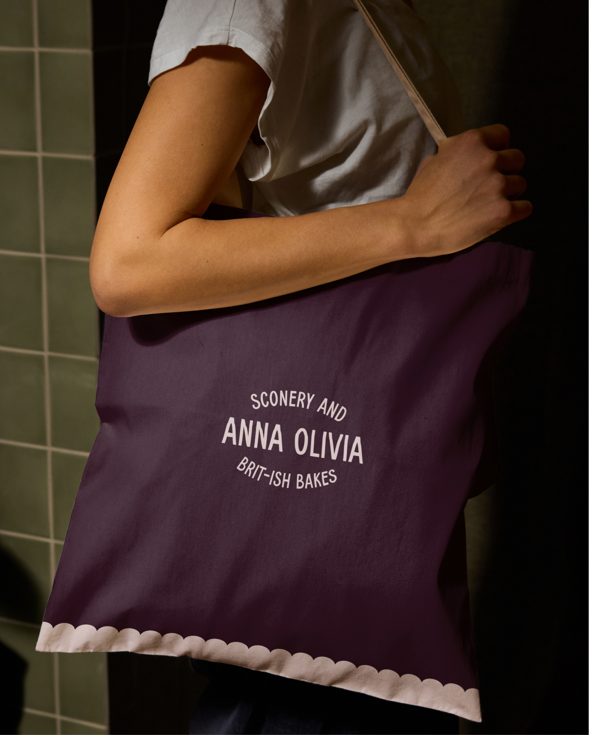
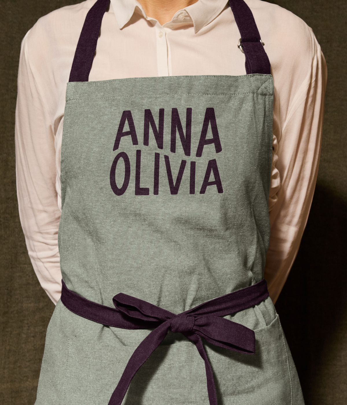
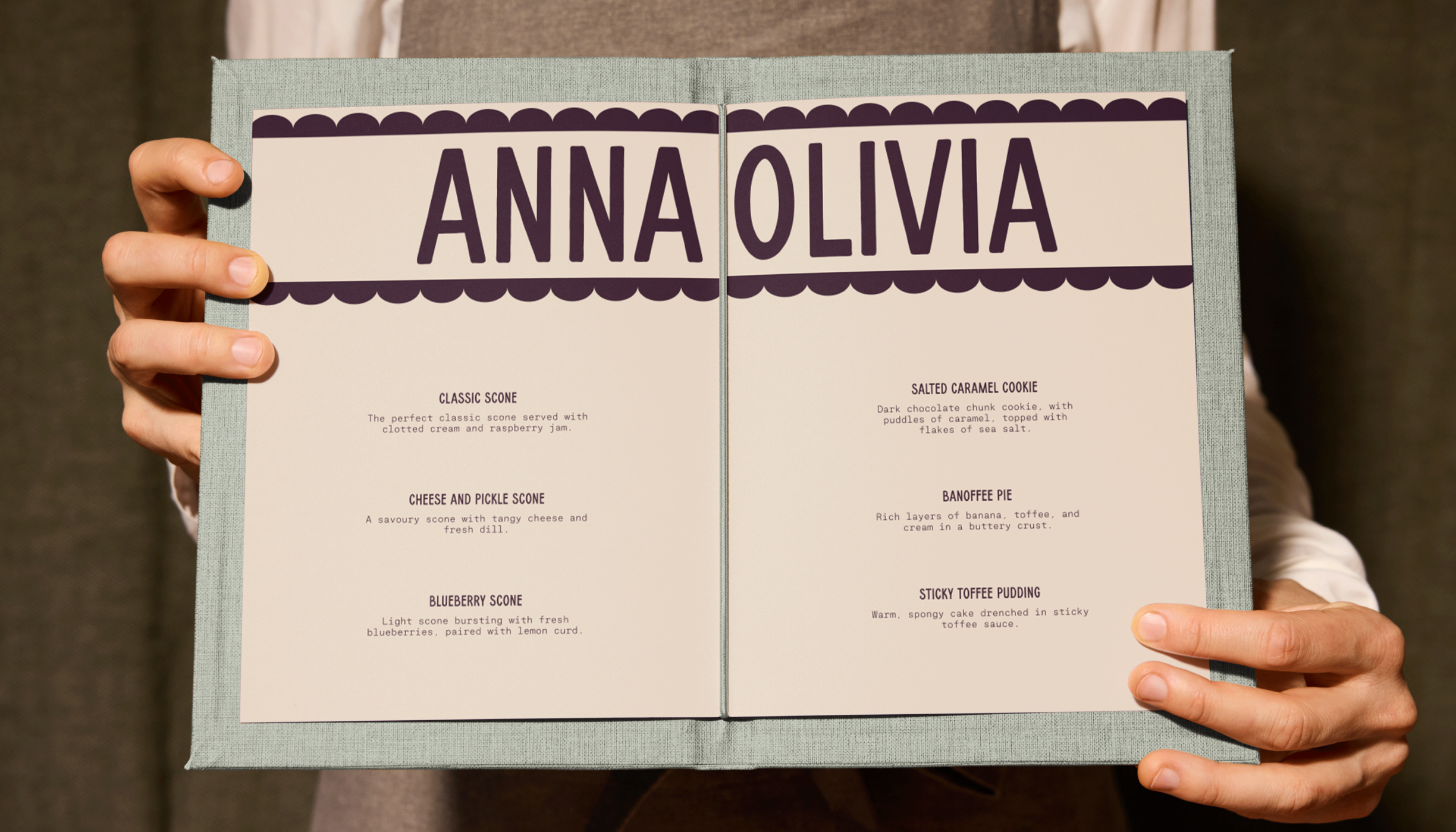
The visual identity captures this charm with a warm, approachable lens. The logo features bold, friendly lettering inspired by London café signage, reimagined with modern ease. A palette of inviting, warm tones bridges London and the Bay, while scalloped edges and hand-drawn illustrations of baked goods in playful, stamp-like shapes nod to heritage and the journey from Britain to California. Photography is minimal and candid, using natural lighting and tight crops to showcase ingredients, craftsmanship, and attention to detail, highlighting the care that goes into every bake. The resulting brand feels comforting yet refined, playful yet polished, and perfectly reflects Anna Olivia’s mission to deliver delicious, thoughtfully crafted British bakes to the Bay Area.
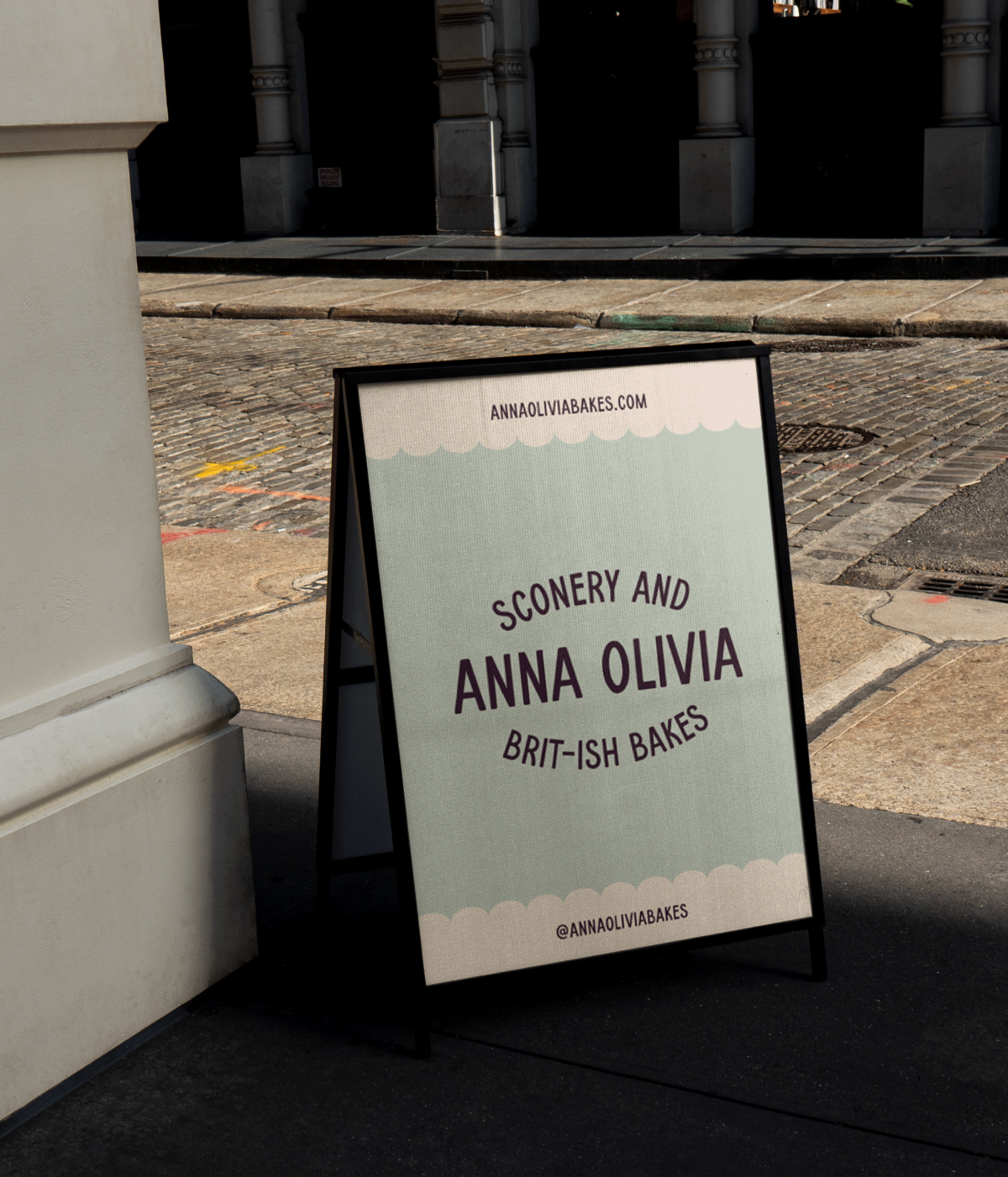
Anna Olivia is a female-owned bakery bringing traditional British scones and small-batch bakes to the Bay Area. Led by Anna, a Brit with a passion for proper scones, the bakery blends classic flavors with fresh, seasonal ingredients, offering a menu that evolves with sweet and savory treats for every occasion. From farmers’ markets to Bay-wide delivery and corporate catering, Anna Olivia ensures that every bake is an experience. During our brand strategy session, we focused on highlighting what makes Anna Olivia unique: the scones. We leaned into the term “sconery” to make scones the hero product, while crafting the tagline “Brit-ish” to convey both heritage and approachability. This positioning allows the brand to feel elevated yet inviting, celebrating British tradition in a way that resonates with Bay Area customers.
brand strategy, brand identity design, website design