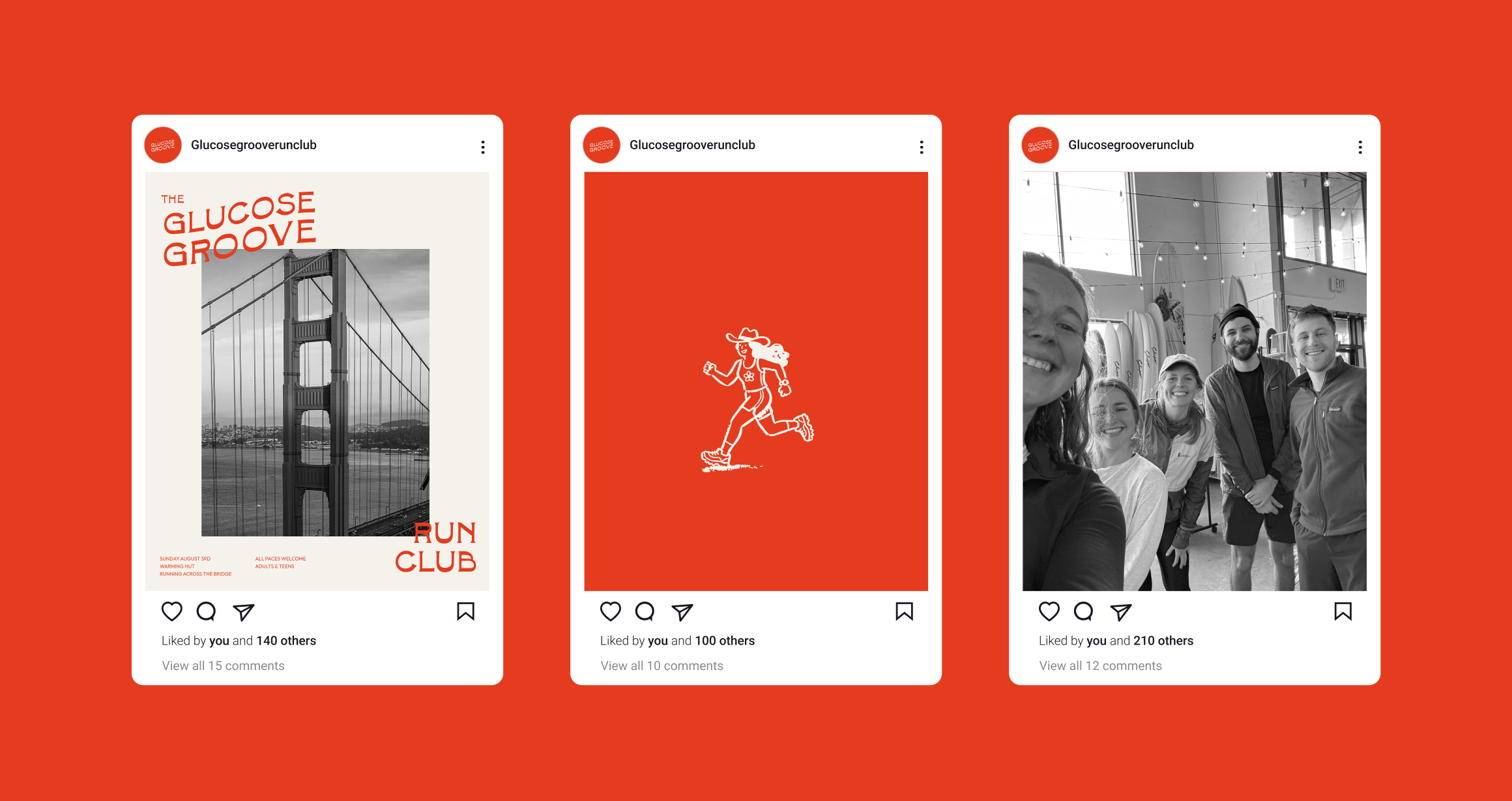
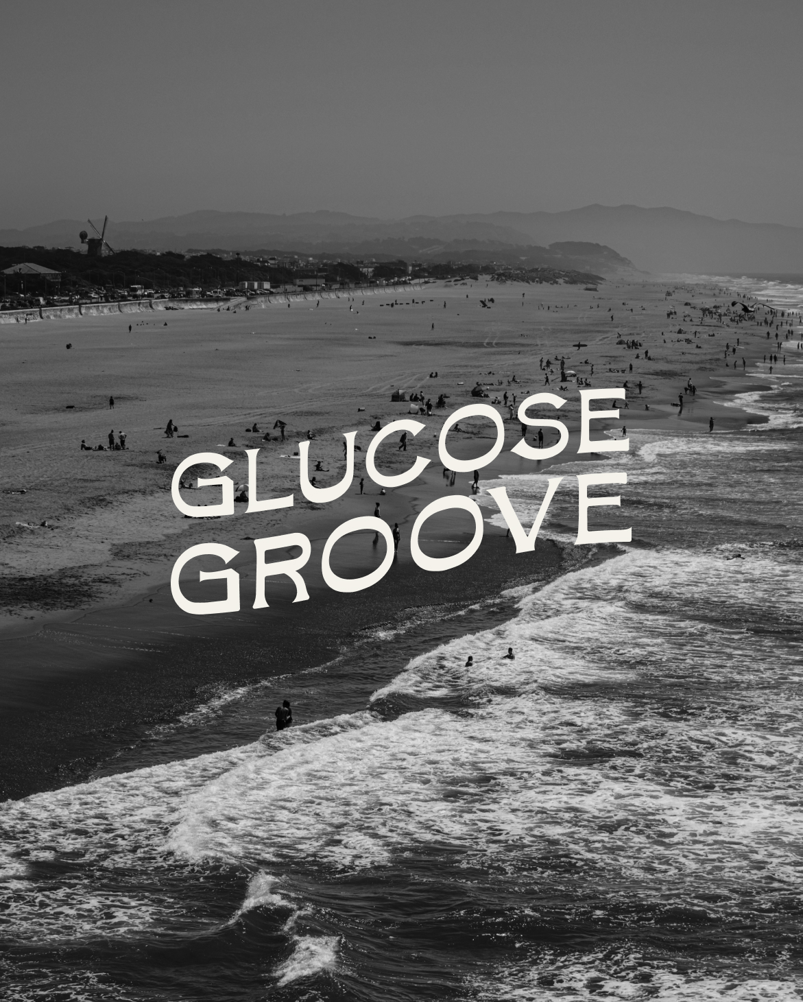
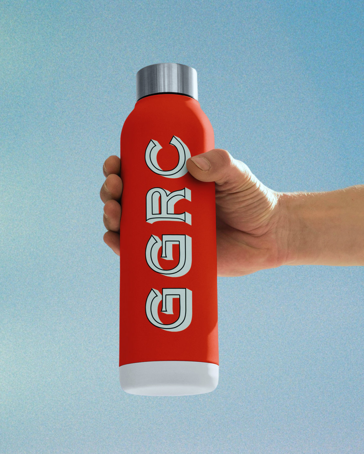
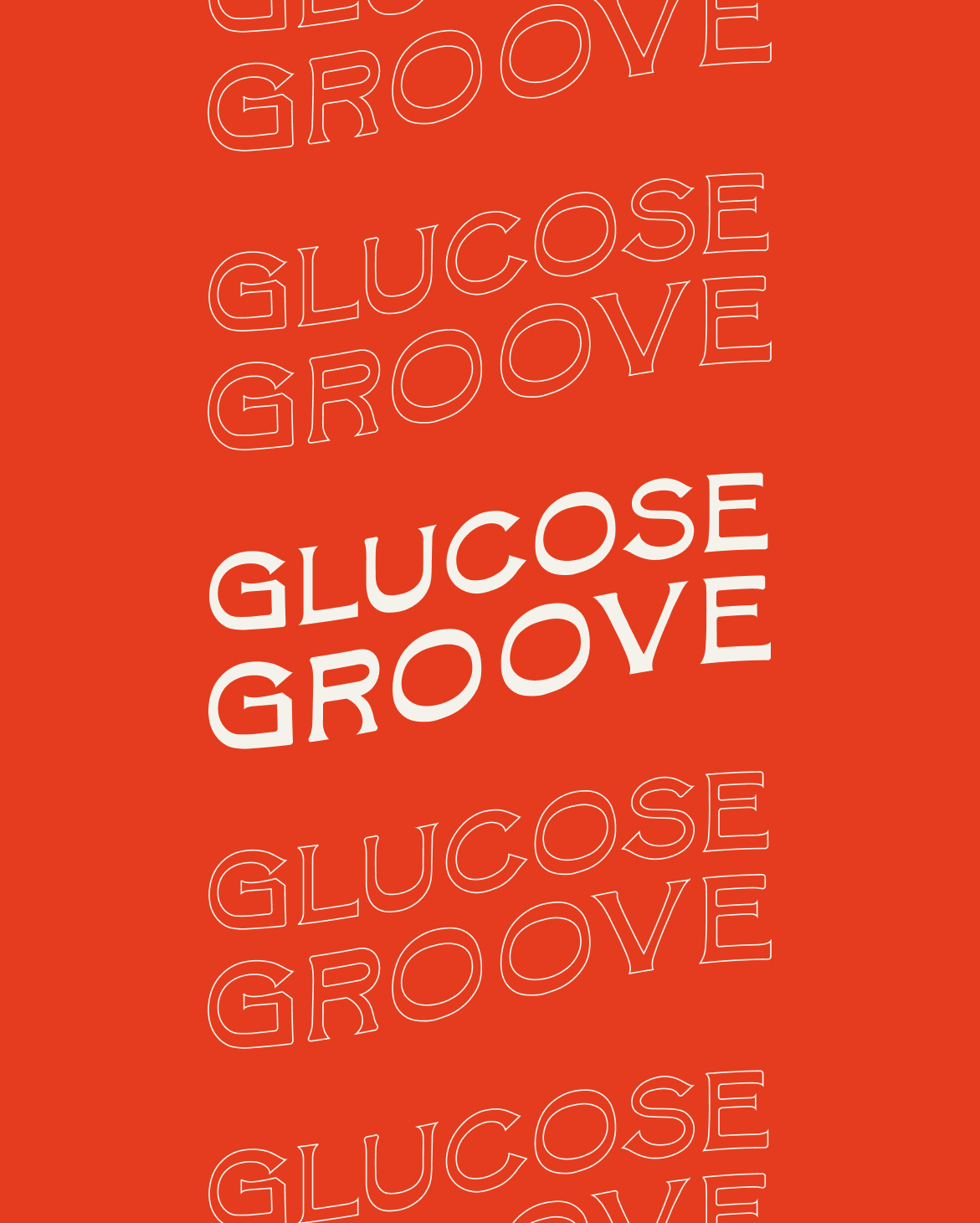
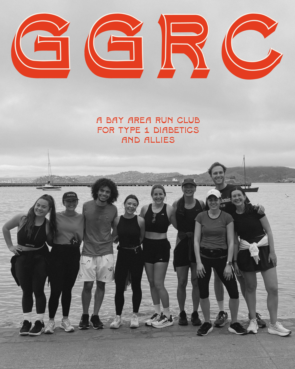
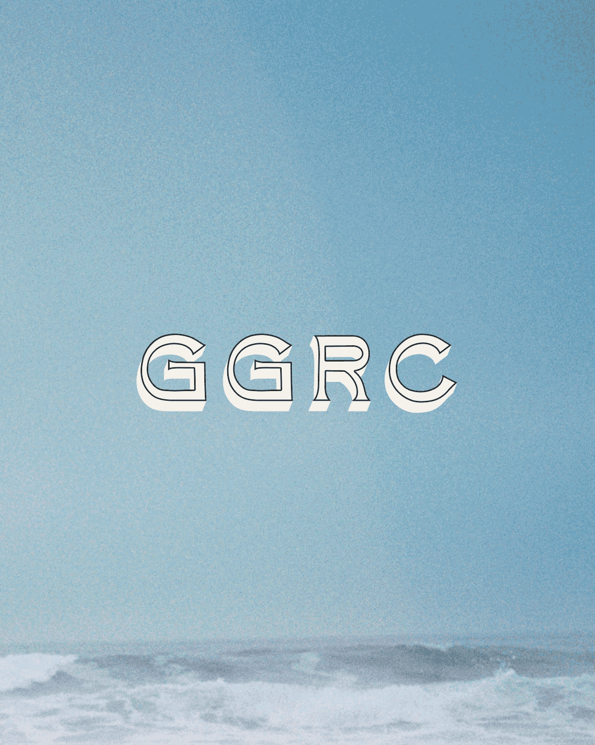
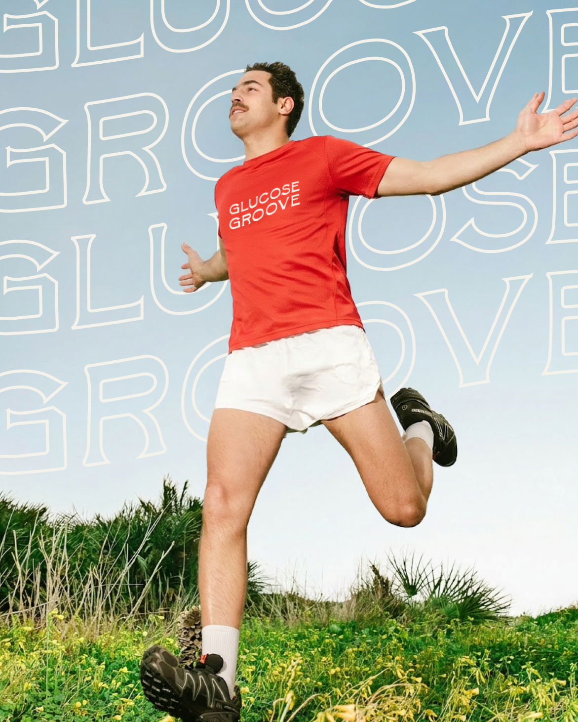
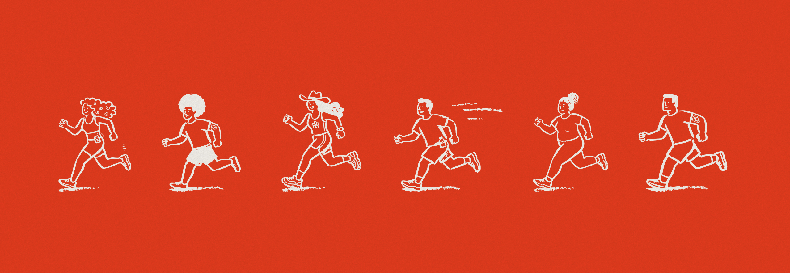
The design system answers that brief with warmth and momentum in equal measure. A kinetic wordmark leads the identity with a sense of forward motion, anchored by a vibrant red that pulses with energy and life. A hand-drawn, characterful typeface brings a human quality to the system — loose and friendly, like a note passed between friends rather than a brand speaking at you. Custom illustrations place runners alongside their CGMs and pumps, making visible what so often goes unseen, because representation here was never an afterthought; it was the whole brief. Imagery of San Francisco's iconic running routes roots the brand in a specific place and a specific community. Every touchpoint works together to say the same thing: this is the group that gets it.
Glucose Groove is a run club for type 1 diabetics and their support systems, founded on the belief that community is a powerful tool for navigating life with a chronic illness. The club has never about pace requirements or performance metrics — it's about mile 3, when your blood sugar is dropping and the person running next to you already knows what to do. The brief called for a visual identity that could hold all of that: the grit, the joy, the medical realities, and the sense of belonging that makes Glucose Groove unlike any other run club.
brand identity, social media design, marketing collateral